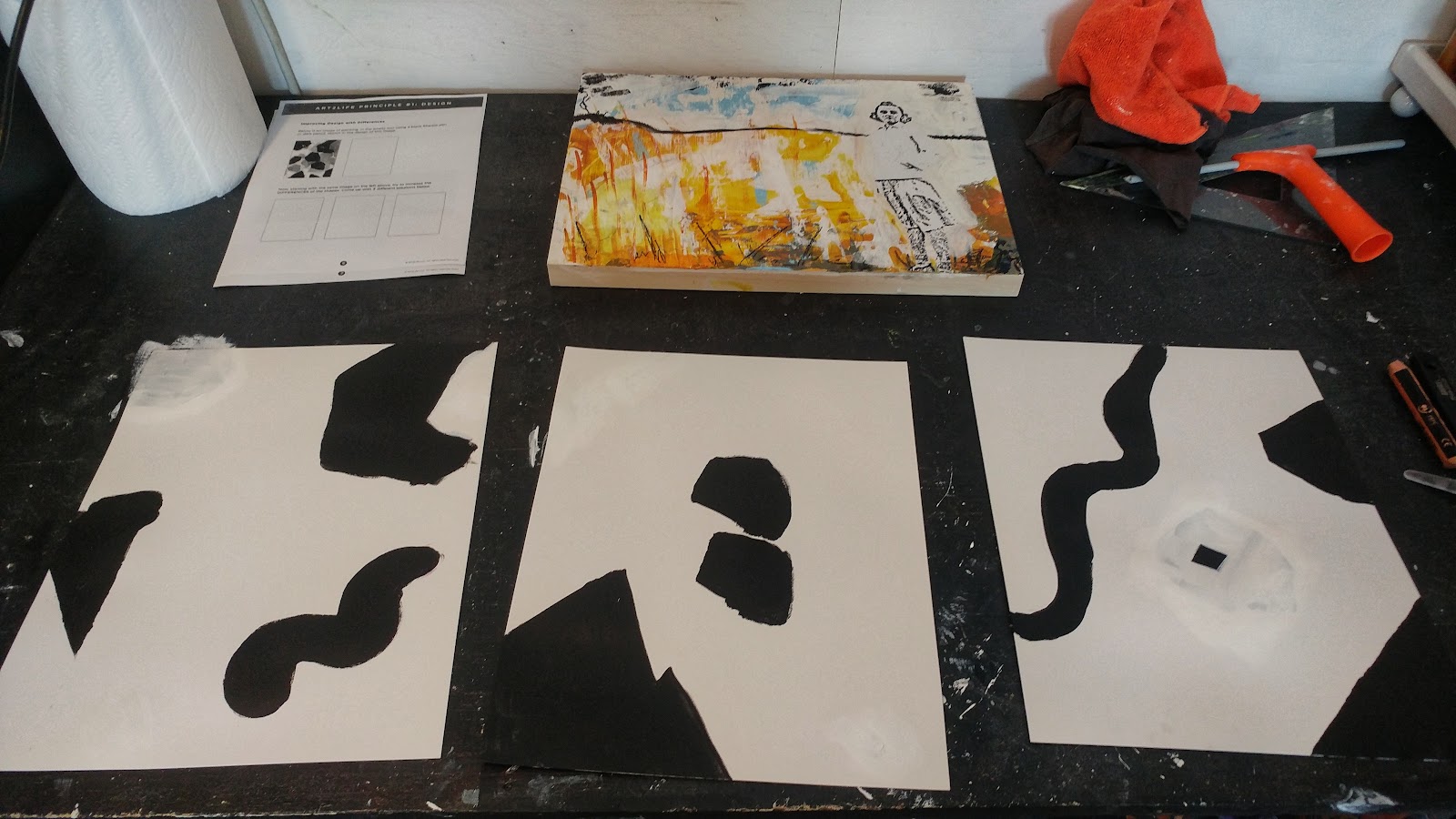
I've been craving a new direction for a while now and the advent of Nicholas Wilton's Free Workshop came along at just the right time. Winding down from creating work (that I started last Fall) for an April show, I noticed some abstract painting sneaking in. Something I'm really ready to explore.
Prior to the Monday, February 14th start, Nicholas offered up these tips to keep in mind as we moved through the workshop, all really good ideas and ones I've incorporated into my own art practice over the years. Sometimes we get so precious and hung up (read: stuck) on certain elements within our work, having a few Go Tos in our toolbox can be very helpful.
Pretips:
5. Turn your work upside down for a new perspective.4. Start with THICK PAINT.3. Embrace Risk.2. Make Two. At Least.1. Principles. Not Rules.
On Sunday, I noticed I was quite apprehensive, sorta anxious and a little bit excited about Monday's start. When talking classes I often feel this... trepidation? certainly nervousness... around fitting in, being less than, or, VERY often, not seeing any improvement or having any AHA moments. I tried to settle my brain monkeys, assuring them that the fate of the world, my world, did not rest on whether I got anything out of this workshop.
It helped.
Kind of.
Day 1 : Design
Watching the first video with a sinking heart, "Oh no! I've seen this before!"
Aside: why do we assume the lightening will strike MOMENTS into something new? I blame movies!
I paused, took a breath, and thought, "Maybe. BUT you haven't seen it with your 2022 eyes, or heard with your 2022 ears. Let it happen."
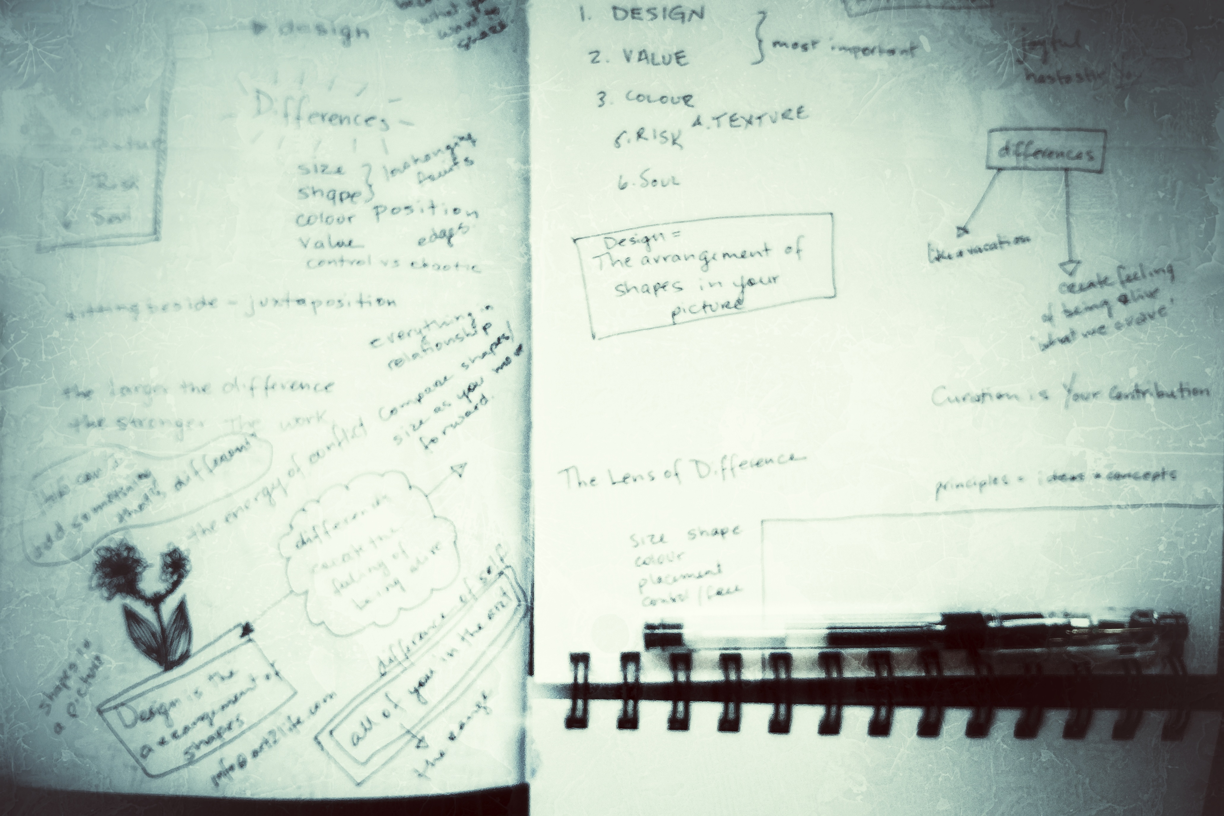
So I did. And a few nuggets made their way into my notes.
Differences = a feeling of Being Alive, what we crave
There are differences of shape and size and position, colour and value, line and edges. Basic Design stuff. But there are also differences in feelings. How you approach your work... happy? sad? angry? And what mood you want to convey...calm? frenetic? These are the thing that will inform the overall basic design elements.
Curation is YOUR Contribution
Of course! How did I not hone down to this nugget before? Funny how you hear something said in a very specific way and everything galvanizes around it. I think I've always thought of it as "editing" which has always felt like 'correction' or 'wrong vs right'. Something I should inherently KNOW (and the corollary if you don't, you're stupid/dumb/an idiot/fill in with whatever self-recrimination you want). Curation on the other hand, feels like CHOICE and makes so much more sense to me. ALL marks are valid. But for THIS work? Maybe not *that* mark. Do you see the difference?
Has to stir YOU first.
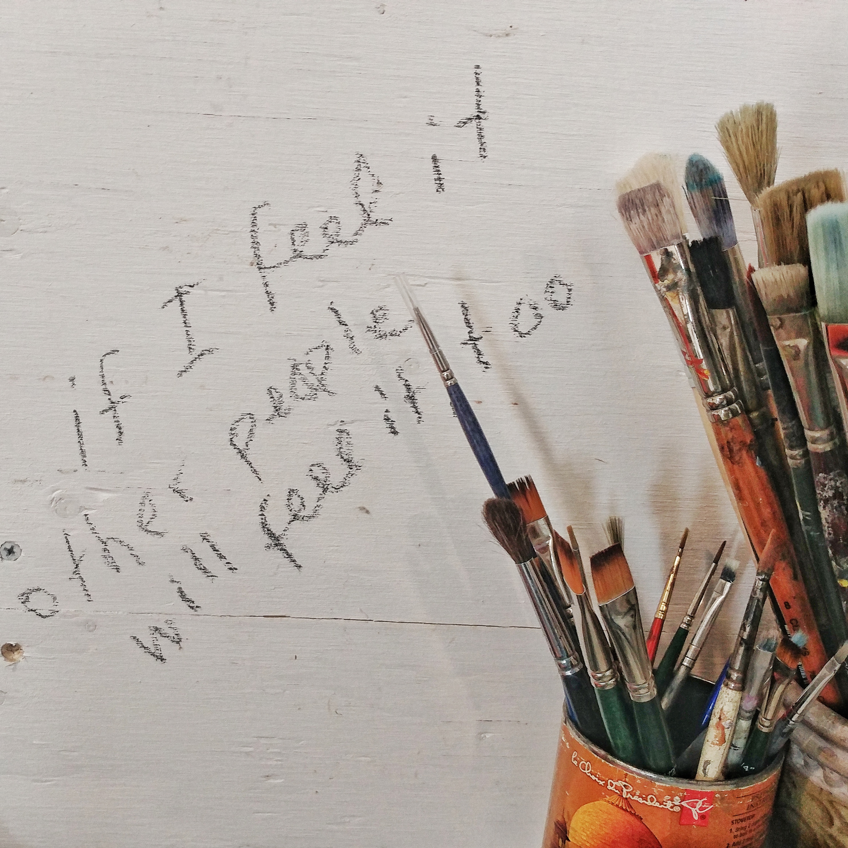
Just last week I was listening to a podcast...something I haven't done in years and decided to start up again. only during busy work however. I find words, sometimes even music, disturbing whilst I am in the creation phase... and wrote this on my wall, "if you feel it, other people will feel it too'. So this felt like a validation for that thought. So often when I get moving into a piece, particularly assemblage, I will choose an element because it fits, is accessible, doesn't make me angry/throw up/irritate but not always does it make my heart sing. Time to change THAT!
Afternoon Live Session
Two viewing notes:
- It makes me giggle whenever Nicholas draws a rectangle on his rectangular pad of paper to offer up an example. I can hear every art teacher I've ever had scream, "Use the WHOLE page. Right to the edges."
- I love Nicholas's energy, when he really gets going, "Do You Get It?" comes fast and furious and I want to shout back, "I DO! I DO!"
This was written on the FB group by a fellow workshop participant and it HIT something deep. I'm not sure I would use the word "conflict" but I wholeheartedly get the sentiment. I have yet to fully explore this notion.
Question to Ask: How can I make something that's different?
I want a whole LIST of questions to ask myself whilst in the process of creating. This is a Good One. It pertains to the elements within a painting/piece not its entirety.
The larger the difference, the stronger the work
Again difference pertaining to the elements not the whole. This is really galvanized if you see a print of a pretty landscape, say. Lovely, for sure, but not energetic. Kind of a One and Done, viewing. The best works, even representational, have something that pulls your eye back into the work. Jaggedy edges vs smooth. Dark moody light vs ethereal bouncy light. Altered perspective to enhance a tree or barn or flower. In short, difference.
Everything is a relationship...compare shapes/size as you move forward.
This one is super personal and a bit of an AHA moment. As I review my work, I often look at it as a whole rather than the specific elements. If the elements don't relate to each other, playing off their differences, the overall whole may feel balanced but not energized. It's one of those back pocket tips that can really help figure out what's NOT working. This might have been my most useful take away of the day.


No comments
Post a Comment
I read every message. Please click "Notify Me" so we can keep the conversation flowing!